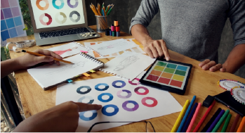
Typography is the art and technique of arranging type to make written language legible, readable, and visually appealing. It involves selecting typefaces, point sizes, line lengths, line-spacing (leading), and letter-spacing (tracking), among other aspects. Typography is a fundamental element of design and plays a crucial role in how text is perceived and understood.
- A typeface is a family of fonts (e.g., Arial, Times New Roman), while a font is a specific style and size within that typeface (e.g., Arial Bold, 12 pt). Choosing the right typeface and font is essential for conveying the desired tone and style.
- Typographic hierarchy helps guide the reader’s eye to the most important information first. This is achieved through variations in size, weight, color, and spacing to create a visual distinction between different levels of text, such as headings, subheadings, and body text.
Overview
Text Presentation: Typography involves the art and technique of arranging type to make written language legible, readable, and visually appealing.
Communication Tool: Typography communicates not only the content but also the tone, mood, and personality of the message through font choice, size, spacing, and style.
Branding Element: Typography plays a crucial role in branding by conveying the brand's identity, values, and voice through consistent use of fonts across various media.
Visual Hierarchy: Typography establishes a visual hierarchy by prioritizing and organizing information, guiding the reader's eye through a piece of text and emphasizing key points.
Design Element: Typography is an integral part of graphic design, influencing the overall look and feel of a design, from print materials and websites to advertisements and packaging.

